10 Biggest Logo Redesigns of 2016 (And What We Can Learn From Them in 2017)
Last year was a huge year for rebranding. Some of the most well-known former tech startups and other big brands unveiled brand new logos.
Some of the redesigns were met with universal praise… and some were met with controversy or outright derision.
This post will cover 10 recent logo or icon redesigns. Love them or hate them, they can teach us a thing or two about the landscape for branding design trends in 2017.
1. Google
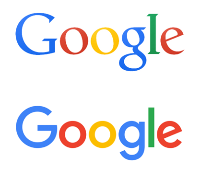
Technically, Google’s rebranding happened in late 2015, but it paved the way for a year of flattened and modernized tech logos.
With their logo redesign, they finally bid adieu to a serif logo that had graced the most visited site on the internet for a full sixteen years, since 1999.
While the logo had been updated several times during that span, to make the emboss a little subtler, this was the first major update.
There is nothing risky here. It is almost a given that a tech company looking to modernize would update their serif logo to sans-serif font, and flat design has been almost the default design aesthetic since Apple ushered it in in 2013.
Still, it was a signal of sorts that flat design is here to stay – after all, Google is willing to pin their logo on it.
This move triggered a number of other brands to move away from skeuomorphic design.
2. Instagram
In one of the most-discussed redesigns of 2016, Instagram finally replaced their skeuomorphic camera icon with a more modern and minimalist gradient icon.
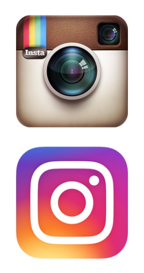
The white-on-gradient look corresponds nicely with Instagram’s companion apps, which include gradient-colored linework over a white background.

As can be expected for a branding change of an app used by so many people, the reaction was immediate and immense. Many simply lamented the loss of their familiar, if outdated, logo.
Others noted the genericness of the gradient color scheme. Some just complained about the line image inside the logo, that looks about as much like a camera as it does a front-loading washing machine.
Still, the vibrant logo is an indicator of the continued neonization of logos, and a signal that we’ve only got more colorful logos coming our way in 2017.
3. MasterCard
While both Google and Instagram’s logo redesigns were varying attempts at modernization, MasterCard’s was an attempt at becoming more digitally accessible.
The original rendition of MasterCard’s overlapping circle logo was introduced in 1968 and included three colors. Starting in 1990, the logo was brightened and the center color of the overlapping circles was scrapped for the interlocking lines we are familiar with.

There is no need to save ink on the internet, so the new design brings back the third color, returning the original vision for the Venn diagram logo. The new design also separates the wordmark from the logo, so that it is easier to read when shrunk to fit a phone or tablet. Now that these are separated, it allows the overlapping circle design to be more iconic.
In fact, 2016 saw a number of logo redesigns that moved towards a more “iconic” look less dependent on the brand name being present for recognition. This is sure to continue into 2017, as brands want to reach the visual equivalent of being a “household name,” from our smartphone and tablet screens.
4. Zendesk
Speaking of brands moving to more of an iconic look, Zendesk followed in those same footsteps last year when they dropped their lotus flower logo and highly recognizable (for better or for worse) Buddha mascot.
They moved to an entirely new branding language, built out of simple shapes, flat colors, and friendly animations.
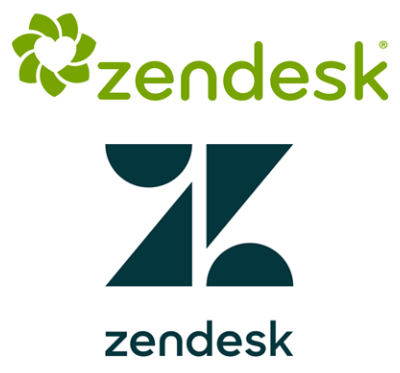
The move sunsetted a mascot that was divisive for some, and swept in a more future-proof system that they were able to apply across their whole product line.
The new branding language is best understood in motion; this video from Zendesk introduces the new set of geometric logos:
The kinetic interaction of the shapes for each product explain, in terms simplified down to an emotion, the role of each, and how they work together under the Zendesk umbrella.
It is an extremely ambitious move for a brand, building a new visual language from the ground up, but one that I am hoping carries through with other brand redesigns in 2017.
5. Uber
In early 2016, we got a big branding update from Uber, with an update to their logo as well as to their app icon.
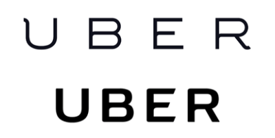
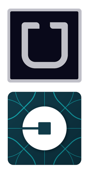
Here we have another move to a more “iconic” look with the app icon, but who’s to say how successful it really is.
The logo change was met with, as you might expect, quite a lot of complaints. It certainly seems like the kind of design change that would leave a frequent Uber rider confused trying to find the icon on their home screen.
6. Kodak
Kodak, one of the most well-known companies in the photography sphere, missed out big time when they acted too slowly to stay on top of the consumer market with the modernization of film to digital.
Their core market has shifted from regular consumers to a more industrial/professional context since that time. However, they are starting to edge back into the consumer market, and with that move decided to make a throwback to a logo from a bygone era, when they were more mainstream with that group.
Here’s their 1971 logo, their 2006 logo, and the throwback 2016 logo:
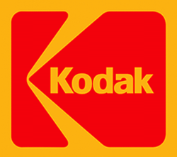
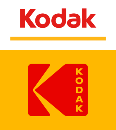
The new design uses the available real estate of the recognizable, camera shutter logo in a much better way than the original 1971 design. While it is a step backwards, in a way, it puts Kodak back in line with a trend towards more color rather than sleek reliance on white space.
7. Netflix
Unlike other brands on this list, Netflix wasn’t redoing a logo or icon. Instead, they simply added a new element to their brand language.
The new N icon serves as a stand-in for the full Netflix logo in instances where the longer logo won’t fit.
There are no plans to redo the current logo with this more ribbon-like look, which some suspect is meant to bring to mind the “card” layout of Netflix’s UI.
This new capital-N logo is part of a continued push towards more branding flexibility across a variety of digital platforms such as mobile apps and social media, similar to MasterCard’s update.
8. Pandora
Pandora came out with one of the year’s safest redesigns, moving from an all-uppercase serif logo in navy to an all-lowercase sans-serif logo in bright blue. Yawn.
Of course, the geometric rhythm of the letters definitely seems more in line with the times, but it is so forgettable that there is practically nothing left.
In addition to the new wordmark, Pandora came out with a monogram P logo to use as their app icon and in other square contexts.
Users criticized it for looking eerily similar to the PayPal icon, minus the darker P, but it does benefit from being able to be styled in a wide variety of ways depending on the genre of music being advertised:
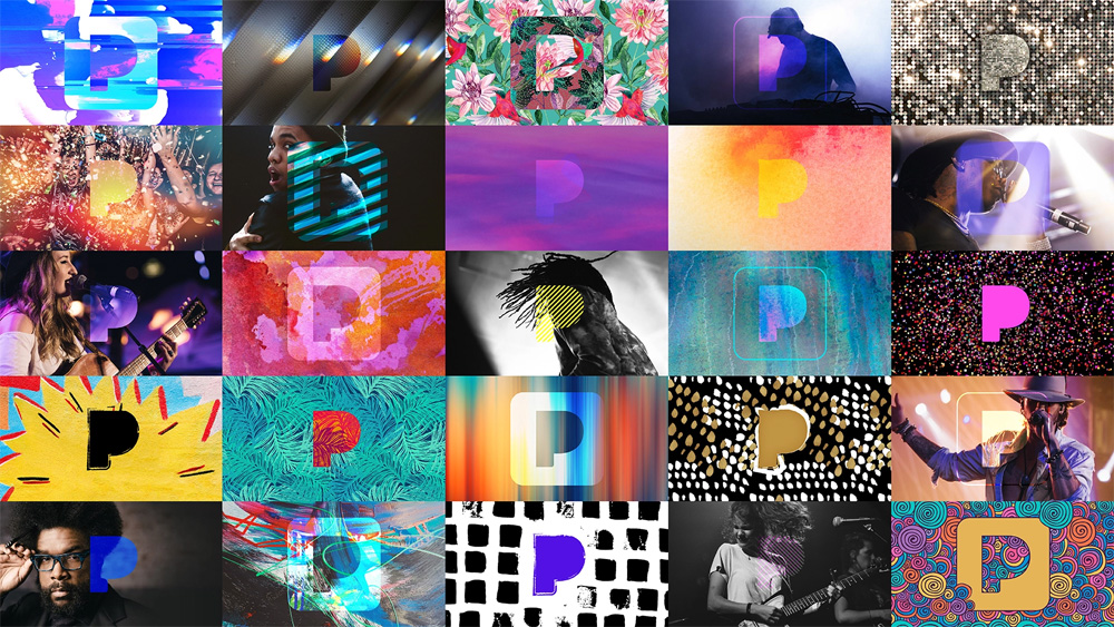
In 2017, we are sure to see more of these variations on logos to personalize them to different subsets of users.
9. Meetup
I have to admit… I was pretty disappointed when I saw that Meetup changed their logo! It was always a pretty dorky logo, but a comforting kind of dorkiness, and absolutely the perfect concept for a service where users create their own groups to meet others based on interests.
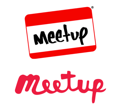
The new logo just feels awkward, and not the relatable kind of awkward like the old logo. Not just that, but the entire rebrand was all over the place.
Here we have a logo that moved to a flat, one-color, hand-written script look, but in the icon we have a weird “swarm” concept that only really works animated:
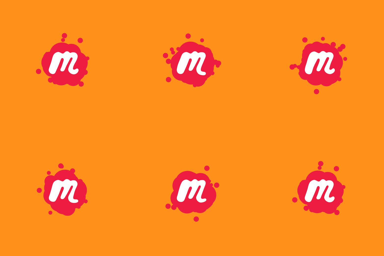
Similar to Pandora, this swarm concept has been carried over to show the variety of groups Meetup caters to:
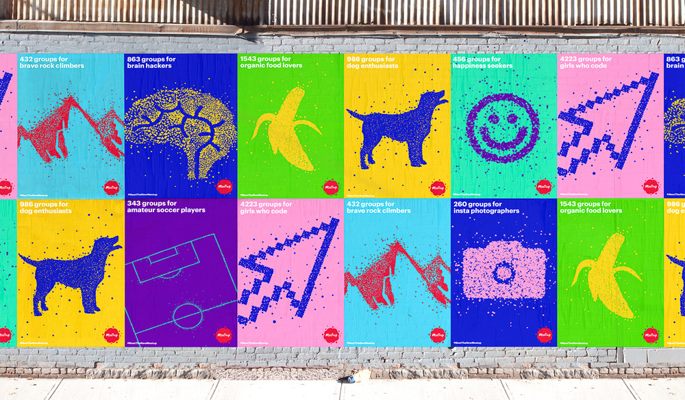
Here the swarms make a little more sense. Still, the animated logo is pretty cool and definitely a trend that has been increasing in popularity over the last few years. Maybe 2017 will be the year animated logos really take off.
10. Dell
Dell went through a redesign of their logo in 2016, but blink and you might miss it:
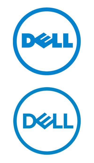
The new design is slimmer and more balanced overall, fixing something weird in the tilted E. The new logo is more proportional and designed for the express reason to look better at an ever greater variety of scales.
Wrapping Up
Last year was a huge year for rebranding and there are many, many examples of other companies that redid their logos or app icons. Still, there are a few factors unifying them:
First and foremost, flat colors and simple shapes is the name of the game. With a few obvious exceptions (like Instagram’s abundantly colorful gradient – though this is still a flatter rendition of their old app icon), logo designers are simplifying their logos down to the bare essentials. Some are going for a truly iconic look, especially to grow their recognizability factor in a screen full of tappable icons.
Though many brands are decreasing the number of colors in their logos, the colors that remain are going big and bold. Neon colors are in, both as a singular color and as part of a vibrant color scheme.
Digital accessibility is a growing concern. We are moving to using smaller screens more and more, and it is vital for brands to have logos that work at these small sizes. Dell and MasterCard are great examples of this trend, if one could call it that.
Finally, there are some trends that have been growing the last several years – maybe 2017 is the year they take main stage. Animated logos are becoming increasingly accessible due to faster internet connections and more use of the internet within apps. And the trend of many variations on the logo as demonstrated by Pandora and Meetup is an interesting one that could take off if done well.
What was your favorite recent logo redesign? Share in the comments below!

