5 Logo Design Trends to Watch in 2018
You’ve undoubtedly heard the expression, “a picture is worth a thousand words.” Believe it or not, this saying is rooted in science.
A phenomenon called the “picture superiority effect” provides an explanation for why we are more likely to remember visuals than words, particularly if some time has passed.
A whopping 80% of our brain is devoted to processing visual information, and 90% of the information we pass to our brains is visual, rather than written.
![]()
Source
So pictures are more memorable than words, and we process them more quickly because that’s how our brains were designed to function.
As a brand, it pays to have that “visual footprint,” that motif that your customers or potential customers can recall long after they first laid eyes on it.
For some brands, that could be a mascot: think Progressive’s Flo or Geico’s familiar gecko. But every brand can use their logo this way, as well.
Changes to a brand’s logo can be controversial, but they can also keep a brand in line with prevailing attitudes about design, and with the direction they are moving as a company.
Even huge corporations can – and do – tweak and change their logos to stay in tune with the times.
This post will examine some of the biggest logo redesigns of 2017, and use them to analyze what logo design trends we may see fully take root in 2018.
Keep reading to learn the five biggest logo design trends emerging right now.
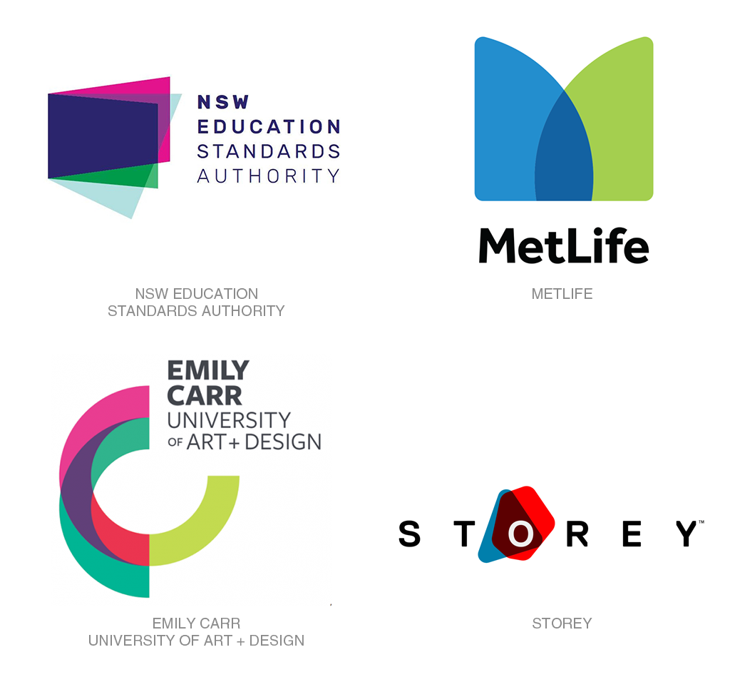
1. Flat Color Overlays
Let’s start with one of the biggest logo trends we’re going to see in 2018, because it’s already here: flat color overlay logos. While this type of overlay technique is nothing new, an explosion of colorful logos is putting it to the forefront of brands’ minds as a concept that is neither dated nor too risky.
The idea is this: simple, geometric shapes in bright, solid colors, overlaid. The overlapping parts of these shapes create new shapes and colors.
Often, there are a lot of colors at play, and this trend sort of continues the neon trend I highlighted in my logo trends post.
Because these shapes are often still very simple, they are often combined with a wordmark. Sometimes they are even a part of that wordmark, as you can see in the Storey logo example.
These logos are especially popular right now with large organizations looking to create a sense of trust – such as financial institutions or universities.
We will definitely be seeing more brands move this direction in 2018.
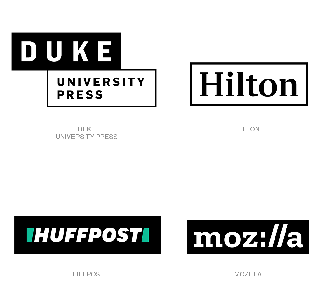
2. Containers
For a while, the trend towards minimalism moved a lot of design towards thin text; brands adopted thinner, smoother wordmarks and default fonts to match.
For 2018, we are going to see a resurgence of bigger, bolder, more impactful text, and with it we are going to see containers become more common.
In some cases, that just means a black slab behind a white logo, as is the case for Mozilla’s clever new logo that incorporates a design similar to a URL.
In some cases, that container is just a box outline around the logo, like the Hilton’s new design, or a combination as seen in Duke University Press’ new logo.
But the sky is the limit, so why stop there? SCI goes for the flat, long-shadow effect with their blue container, the negative space creating a 3D effect with a single color.
And HuffPost, which underwent a name change alongside its redesign, boxes their wordmark in with some neon green slashes.
This effect is useful in that it uses a minimal number of colors, unlike the previous trend, which can be important to brands whose logos will be printed often.
It also comes with a degree of timelessness; these logos certainly will not feel stale in a few years. (Well, except maybe that HuffPost logo. I am not a fan.)
For these reasons and more, we are sure to see more container-based logo designs in the year to come.
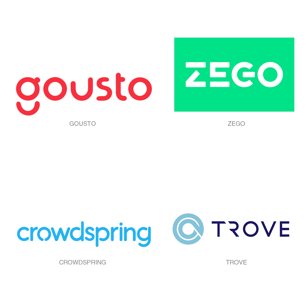
3. Broken Text
Now for something a little more outside the box. (Pun totally intended!)
In recent redesigns, we’ve seen a surge of wordmarks with broken letters. These logos vary in their degrees of variance from the original font and their degree of readability.
Basically, this trend involves the selective disconnecting of letters.
This trend uses negative space to make the wordmark more distinct and, consequently, more memorable than just a simple word. Hopefully in the process, brands do not forfeit legibility for memorability.
This trend works best when the disconnecting of the letterforms serves a purpose, beyond “looking unique.” On their blog, Gousto explains the conscious choice to disconnect the letter G and create the “Gousto smile” motif. A
nd Zego’s logo consciously features the electronics on/off symbol in place of the G, harkening to their insurance services that you can turn on and off.
On the other hand, WSP’s new logo, while pleasing to the eye, fails as a wordmark: it’s very difficult to tell, at a glance, what the letters are meant to stand for.
Judging by the number of brands who have redesigned their logos this way in the past year, it’s likely that this trend is here to stay.
Let’s just hope that this design decision is made with a purpose, rather than just to stand out.
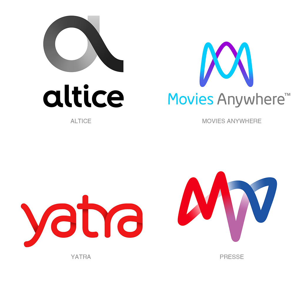
4. Gradient Ribbon
There has been a move towards more colors in logos for a while now, but these “gradient ribbon” logos really push the boundaries.
Sometimes, this technique is used as a part of a very stylized wordmark; sometimes it makes up more of an iconic logo.
In either case, the gradient applied to the logo creates depth in an otherwise “flat” design.
Though they are pretty similar, I like how both the MVV and Movies Anywhere logos incorporate their acronyms in an unobtrusive way. The gradient even helps visually separate the different letters.
IBM Watson’s logo is, in fact, a simplification of an earlier logo that had many more orbiting neurons. It is subtle in a way that feels like a grown-up version of the previous, very skeuomorphic design.
The gradient ribbon trend is definitely interesting, and there are a lot of ways to interpret it: it easily suits wordmark, iconic, and combination logos.
I can’t wait to see how it develops as we head into 2018.
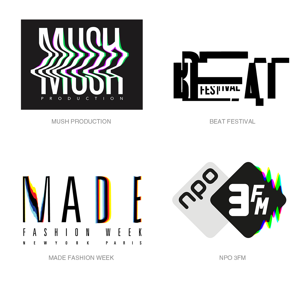
5. Glitch
I hesitated to put this trend in my list because I couldn’t find very many examples, but there is no doubt that the glitchy look is one of the biggest emerging trends right now.
Few trends immediately evoke as rich a set of mental images as the glitch does: technology, certainly, but also a sort of dystopic feel. The look is very edgy.
In some ways, that makes the glitch sort of dangerous as a logo design trend. Brands that adopt it may be timestamping themselves at a very specific point in history, which could quickly make their brand identity feel out of touch with the times.
That said, it works as a symbol for technological advancement, or being at the cutting edge of technology.
Fashion brands have also embraced it as a “paradoxical balance of being both futuristic and retro,” according to the Adweek article linked above.
Of the examples I’ve highlighted, NPO 3FM is the perfect example of a glitch done well – the glitch is a small part of the logo and doesn’t interfere with its readability.
The MUSH Production and Beat Festival logos are concept logos by artists on Behance that show the potential of this trend, though I think both leave something to be desired in regards to readability.
Seeing as it is just picking up speed this year, I believe we will definitely see more from the glitch trend in regards to logo design in 2018.
Wrapping Up
I don’t mean to make this a definitive list of the five biggest trends we will be seeing come to their own in the next year; this list is simply meant to identify some logo design trends I can see growing in 2018.
Logo design seems to be heading in two directions this year.
On one end of the spectrum, we are seeing a move towards highly saturated logos that take advantage of modern printing techniques and use many colors.
The flat color overlay, gradient depth, and in some ways, the glitch trends seem to be moving in this direction.
On the other hand, we have the container and broken text trends that seem to be making more with less. These trends keep the number of colors in a logo small – sometimes as minimal as a single color and white – and focus instead on the use of negative space to create a full imagine in our minds.
What other logo design trends do you see coming to the forefront in 2018? Share your favorite trends, and corresponding examples, in the comments below!