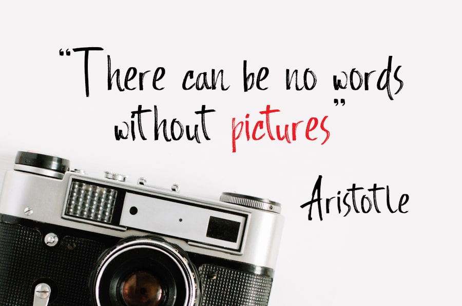
9 Social Media Graphic Design Secrets (from REAL graphic designers)
We’re visual beings, and we’re drawn to visual content online in more ways than before. After all, 90% of information our brain processes is visual.
As social media shifts to visual social media, the opportunity for businesses to get their graphic designs for social media right is huge.
As social media shifts to visual social media, the opportunity for businesses to get their graphic designs for social media right is huge.
1. Show them instead of telling them
Anything visual will almost always beat a bunch of text. Images, videos, graphics, slideshows, GIFs; basically anything that helps catch the eye of the fast-scrolling social media user.
Make sure to present the right images to the right people. That also includes the way you sell what you’re selling.
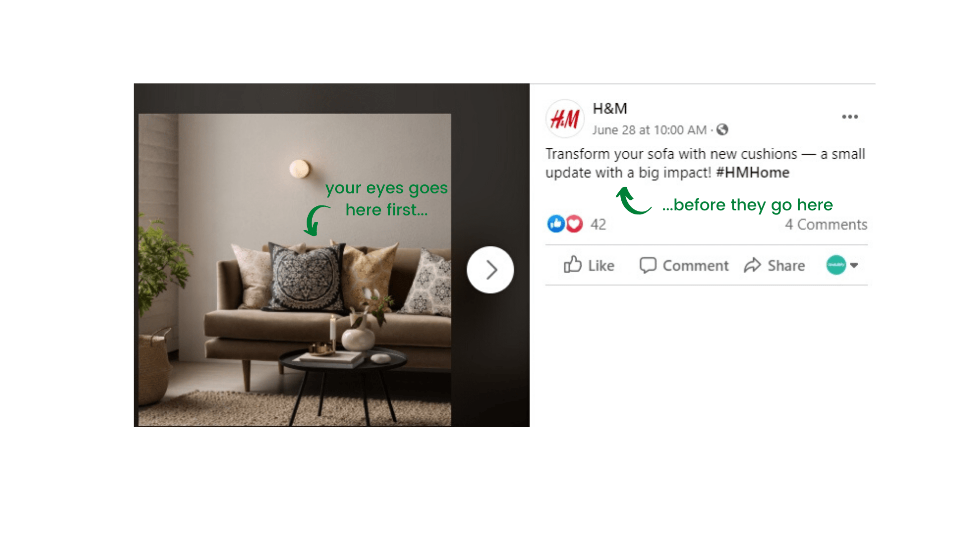
If it’s a product with high visual appeal, say furniture and homewares, use the product image itself to share your message.
But when it comes to selling services or intangible items, such as vacations and trips, it’s best to excite the senses and imagination. “Sip ice-cold Mai Tais on the beaches of the South Pacific while crunching sand between your toes,” gets the point across nicely.
In either case, the text must supplement the image and not the other way around.
2. Sizing them right
Unlike other visuals, a graphic design for social media should always be sized precisely for the platform and place that it’s meant to be used for.
Most images on social media need to comply with the official dimensions if you really them to pop and display correctly.
The optimal for a Facebook post is different from Instagram. Further, a Facebook post will require a different size to a Facebook cover.
Then to add a final layer of complexity, the optimal size for social media image dimensions changes frequently, and often without any notice (ahem, Facebook) so it’s also best to check into an updated guide before starting the design.
3. Images should pop
Vibrant, colorful images attract lots of eyes, so choose unique imagery that has bright, eye-catching colors. Alternatively, a design with high contrast will help attract the eye as well.
If you’re selling food or most general products, be sure that the greens, yellows, oranges, and reds in your images as they generally pop more than black, blues, and greys.
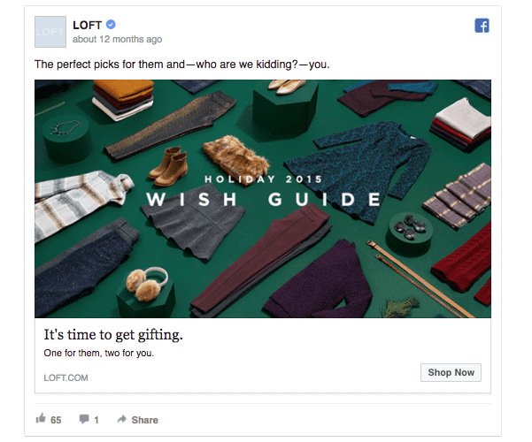
Don’t forget to take the season or event into account when choosing colors either. This Christmas promo graphic design for social media from LOFT is instantly reliable to Christmas but not in an overly cheesy way.
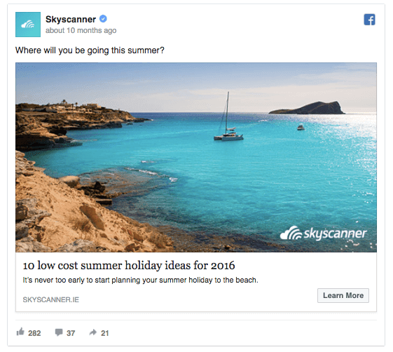
If you’re selling a service, a well-chosen stock image or vector will also work well. Spotify does this consistently well but pairing fairly generic stock images with a simple message.

4. Where the eye goes
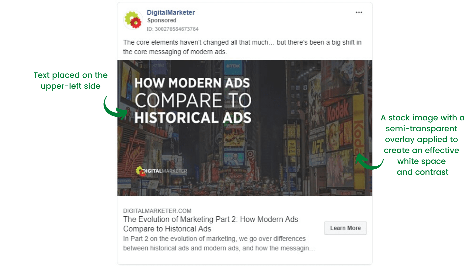
Advertising research shows that people tend to read what’s in the corners of the page more than what’s in the center.
What’s more, we also tend to read in an “F”, “E”, or “Z” pattern, so placing important and eye-catching elements of a social media graphic on the upper left and left side of the graphic will most likely capture.
Larger images and positive space also attracts our eyes first, so keep this in mind when designing your social media graphic.
5. Keep it sharp and simple
With only a few seconds to catch the scrolling social media user’s attention, the KISS principle will always hold true.
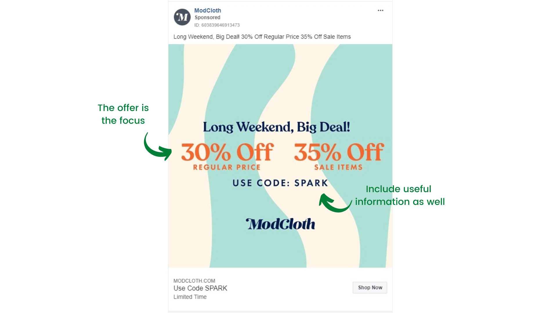
The key here is to focus on just one thing and one thing only. This can be a sale, a promo for an event, or an offer for your free lead magnet.
A simple sale graphic like this from ModCloth is both effective and informative. Anyone looking at this will instantly what you’re trying to sell or offer me.
6. The 20-percent rule
Facebook, despite intense competition from platforms like Tik-Tok and Instagram, is still the social media gold standard for many brands.
In order to increase content quality of users’ feeds, Facebook have a rule that states that image-based advertisements may not have more than 20 percent text.
Well, that’s not strictly true; your ad can have more than 20 percent text, but it simply won’t be shown to as many people if it does.
Use Facebook’s own tool to check how much text is in your ad image here.
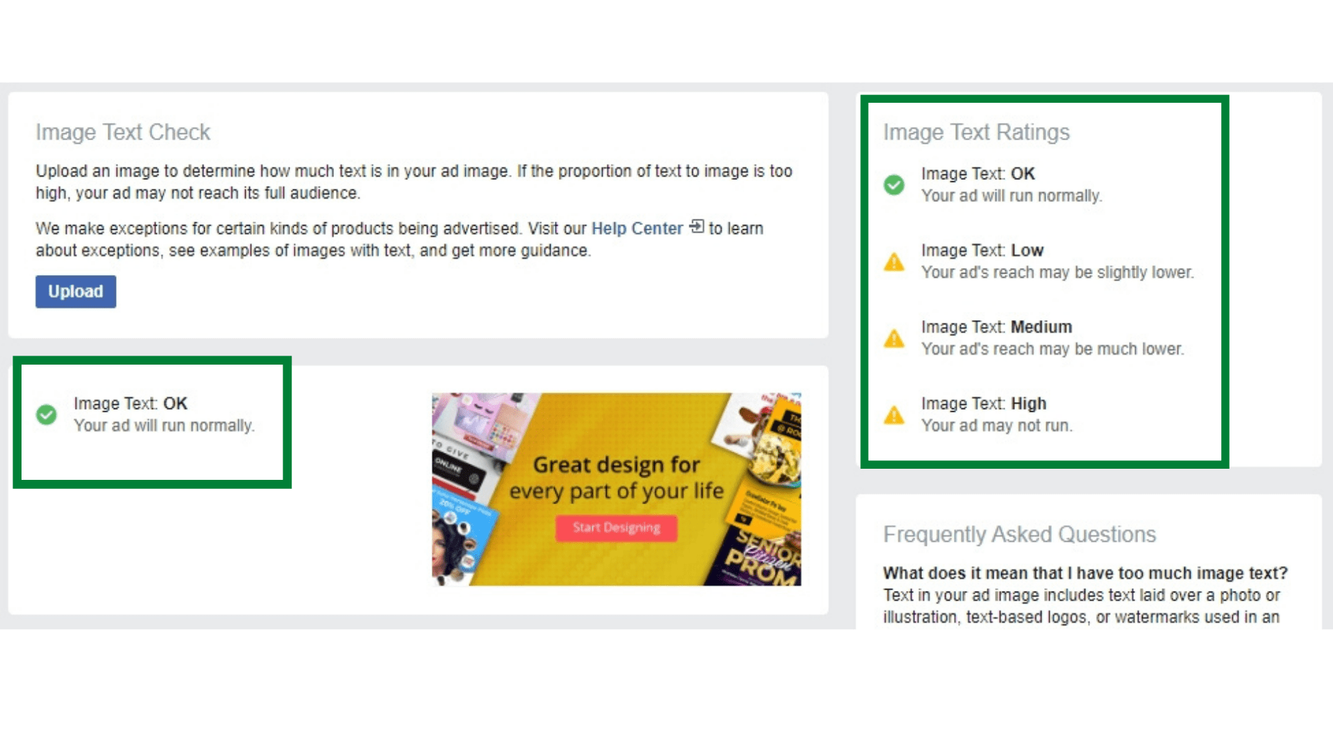
Pro Graphic Designer Tip: Smart placement of text will help your Facebook ad design stay within the 20% rule, so experiment a bit with different text layouts and font sizes before resorting to reducing the verbiage.
7. Typefaces matter
Traditionally, serif fonts are best for print, and sans-serif fonts are best for websites.
This is important since even the best copy in the world won’t be seen if people can’t read it easily, preferably in one glance.
Not sure what font types to use?
Study your target demographics and pick fonts that appeal to them. Do some competitor research and see what (and doesn’t) work. Cherry-pick some that appeal to you and have a play to see what works best with your brand.
If your branding is well-established, using your brand’s existing font types will always work well.
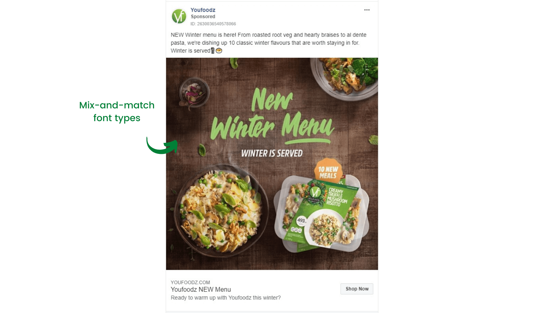
Don’t be afraid to mix-and-match fonts, or try the tried and tested method of font-pairing for some eye-catching visuals.
Pro Graphic Designer Tip: Check out our guide to the Best Font Pairing Hacks
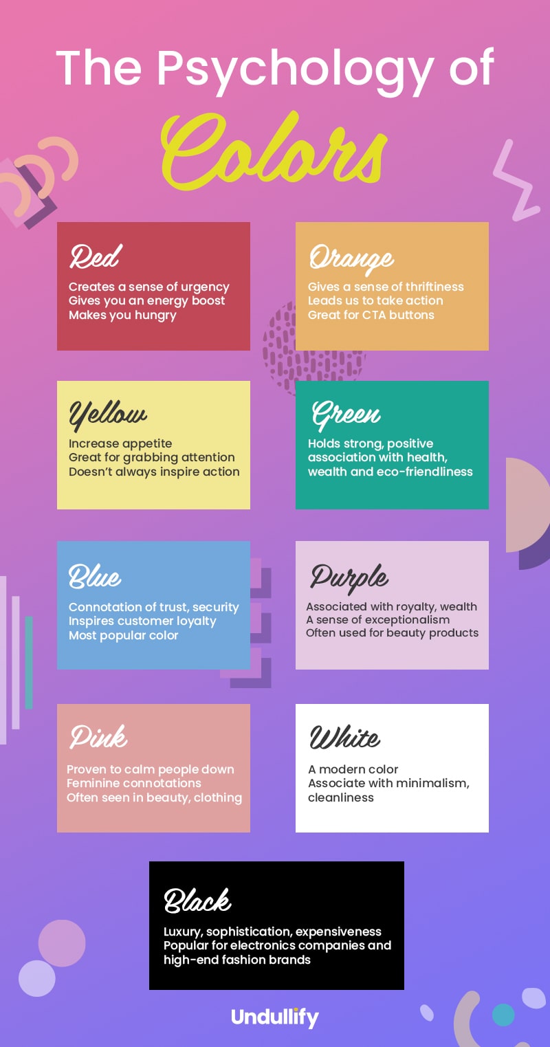
8. The right colors
Did you know that as many as nine in 10 people often choose their purchases by color alone?
Arguably even more important than selecting the right images, choosing the right colors to match your message will always help boost engagement with your audiences.
For example, red indicates urgency while blue indicates honesty and stability. Green is freshness and fertility, and yellow is happiness.
9. Stay visually consistent
Being consistent visually is all about building up trust and familiarity with your audience. Showing up time after time with a consistent graphic design for social media visuals (and brand messaging along with it) will help you “brand” an impression through consistency.
It doesn’t have to be complicated either, simply design your social media graphics using the same logos and colors will be enough.
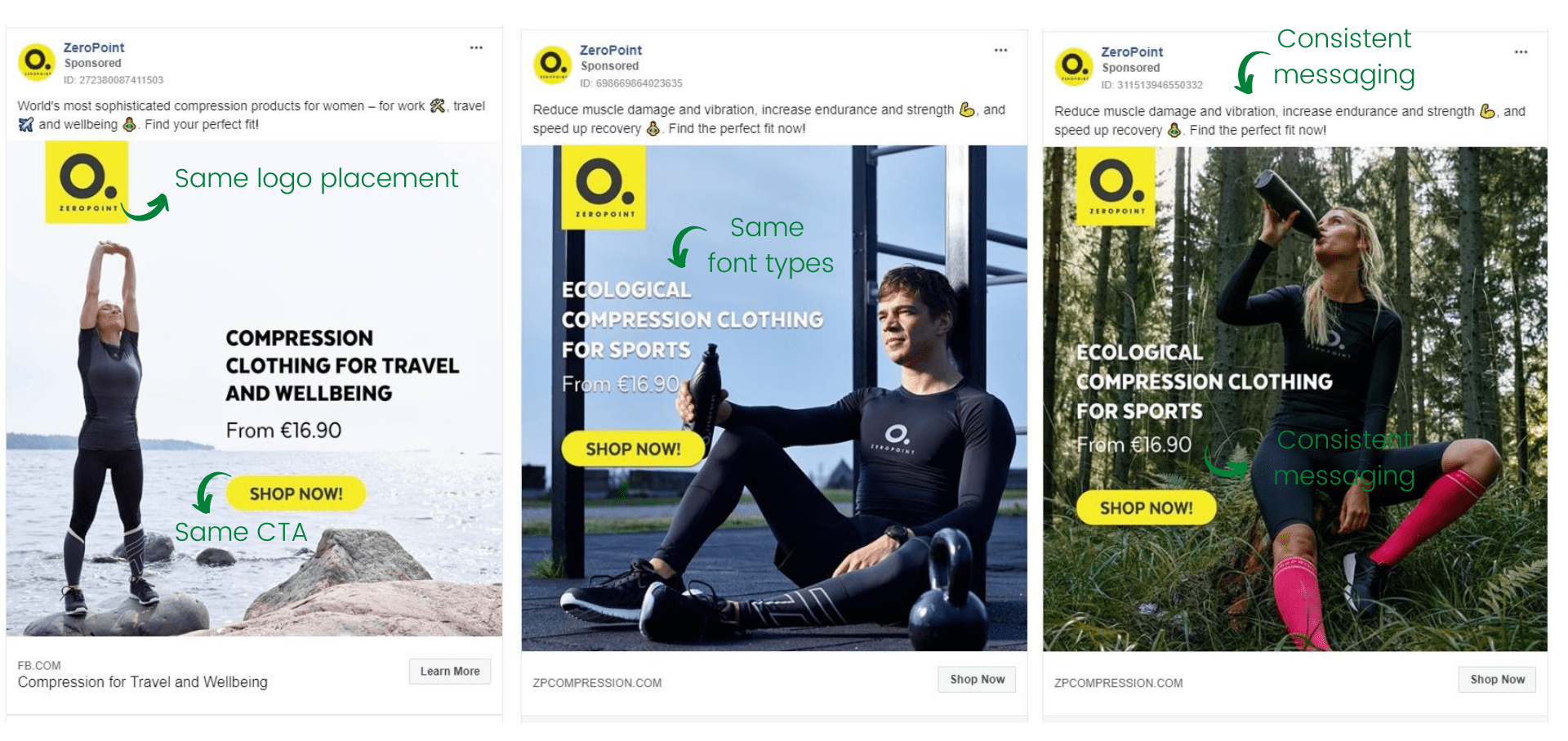
Visually consistent social media graphic designs help people to remember who you are and what your brand is about.
The final word
Getting your social media graphics right doesn’t have to be difficult. The key to getting more eyeballs and engagement on your content is to always think visual first.
Pair this up with the right messaging, and you’ll be on track to wooing audiences and blowing away your competition.