How To Use Color Psychology to Decrease Cart Abandonment
ADRIENNE WOLTER | 8 OCT 2015
The moment you walk into a store, colors begin tugging on your emotions, regardless of whether you notice it or not.
Bright red sale tags scream urgency at you.
Blues calm your nerves, reassuring you of security and trust.
Greens suggest healthiness and eco-friendliness.
Black suggests power and luxury.
Maybe you’re immune, but it’s unlikely. Marketers know that colors drive sales. Colors are such a big part of the equation that the colors are 85% of the reason a consumer buys a product. Not features, or specs, or even price. Colors.
The same is true online. It’s the reason that sale prices are often displayed in red. It’s the reason that PayPal is blue. It’s the reason that you make so many impulse purchases on orange-accented Amazon.
This post will teach you how to harness the power of color and use it on your own website to increase your conversions and decrease cart abandonment. If you haven’t considered color psychology on your website before, you are missing opportunities. This post will show you how to find them.
Color Psychology
In order to use color to your advantage, you first need to understand them.
Colors mean different things to different people around the world. While the associations below are true of Western cultures, they may not represent your target audience.
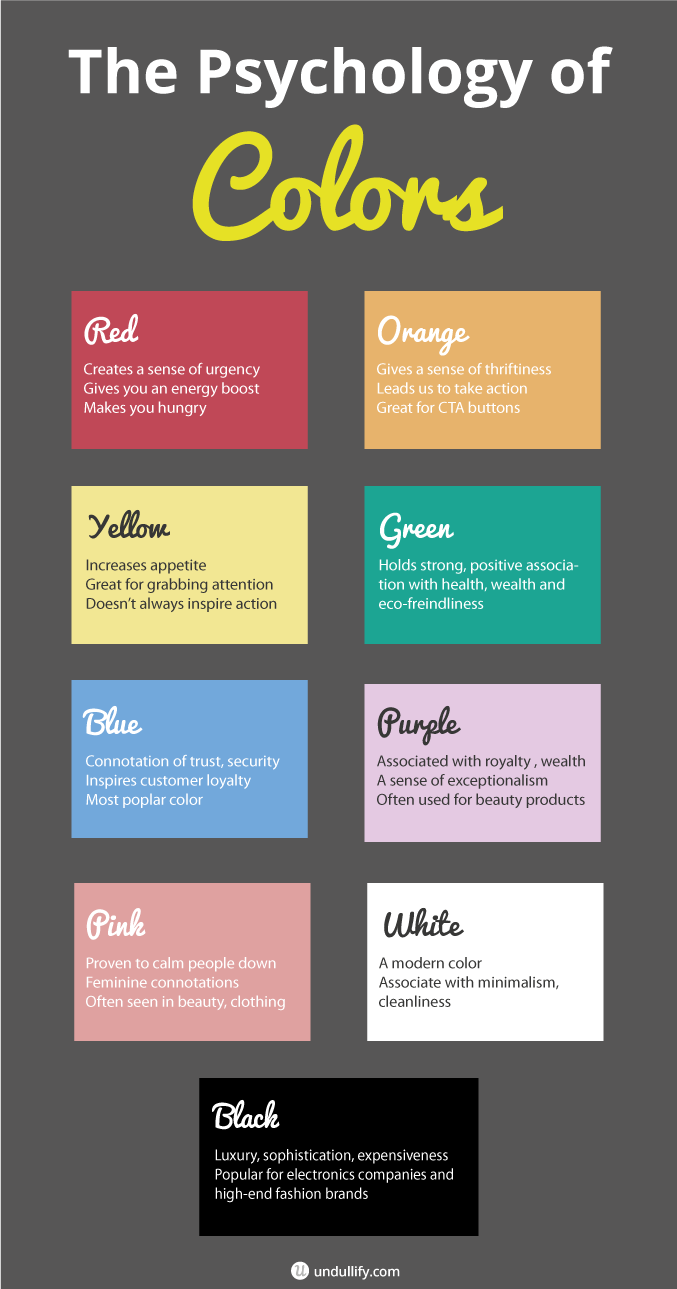
Red
The color red creates a rush of urgency, which explains its most common uses in retail, which are for highlighting sales and clearances. Red gives you an energy boost but also makes it hard to concentrate, possibly explaining its role in impulse purchases. Incidentally, red also makes you hungry, which explains the color decisions of all major fast food chains.
Orange
Another impulse buy color, orange appeals to our sense of thriftiness. We link orange to retailers like Amazon, Home Depot, and Payless Shoesource, all places we look to to provide the best deals. It leads us to take action, and has often been cited as a great color for CTA buttons.
Yellow
The least popular favorite color in the world, yellow joins red in being a color that increases appetite. Yellow is good at grabbing attention (think highlighters, caution signs) but doesn’t necessarily inspire action.
Green
Green holds strong, positive associations for people; associations with health, wealth, and eco-friendliness. Green is a well-liked, relaxing color often used in the energy, finance, food, household, and electronics industries.
Blue
Blue is the most popular favorite color in the world and most common color in corporate logos. It has a powerful connotation of trust and security, and inspires customer loyalty: one study found that customers are 15% more likely to return to a store with a blue color scheme.
Purple
In ancient times, purple dye was the most expensive of all colors to produce, leading to its use as a garment color for the royal and wealthy. Even today, purple carries a sense of exceptionalism, often used for beauty products.
Pink
Pink is scientifically proven to calm people down, which explains Peptol-Bismol. It has obvious feminine connotations and is often used in the marketing of beauty products and clothing.
White
White is a modern color, the color of minimalism and cleanliness. No wonder so many websites have white backgrounds!
Black
Black is indicative of sophistication, luxury, and expensiveness. It is a popular color for electronics companies and high-end fashion brands.
Color vs. Contrast
Although colors have strong associations, as you saw above, that isn’t necessarily an invitation to take the color that aligns most with your business goals and throw it all over your site. Monochromatic websites can work extremely well, but the color you choose also has the potential to feel overbearing.
Instead, it is probably better to think of these colors as accents; they will make a greater, if subtler, impact if they can stand out against neutral background tones.
In some ways, contrast is actually even more powerful than the color you opt for. While the color or colors you use on your website will have a subtle emotional impact on the visitor, it is the contrast that will drive conversions. Test after test has shown that conversion rate is not so impacted by color as by how well the color stands out on the page. If your website is white and green, a red button will convert better than a green button. If your website is red, a green button will convert better than an orange one.
Here are two examples:
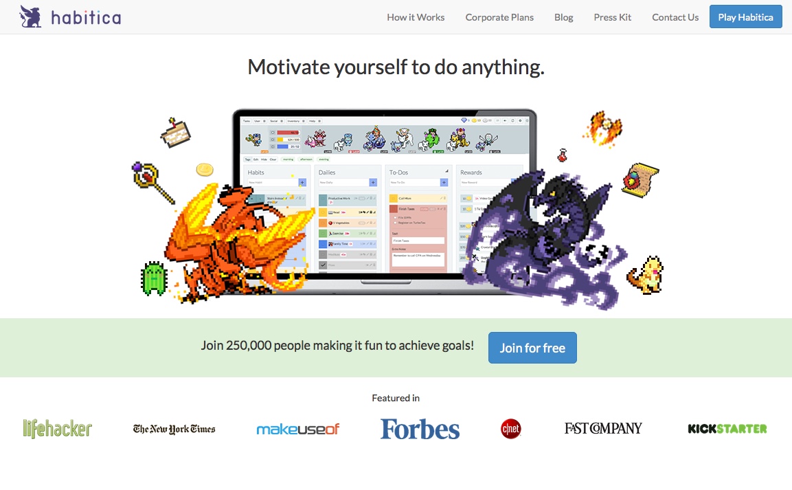
Habitica is a task-tracking tool that turns your life into an RPG. Their CTA button, centrally located on the page and highlighted with a pale green bar, is bright blue. The color is only echoed in the top right corner for a button that does essentially the same thing.
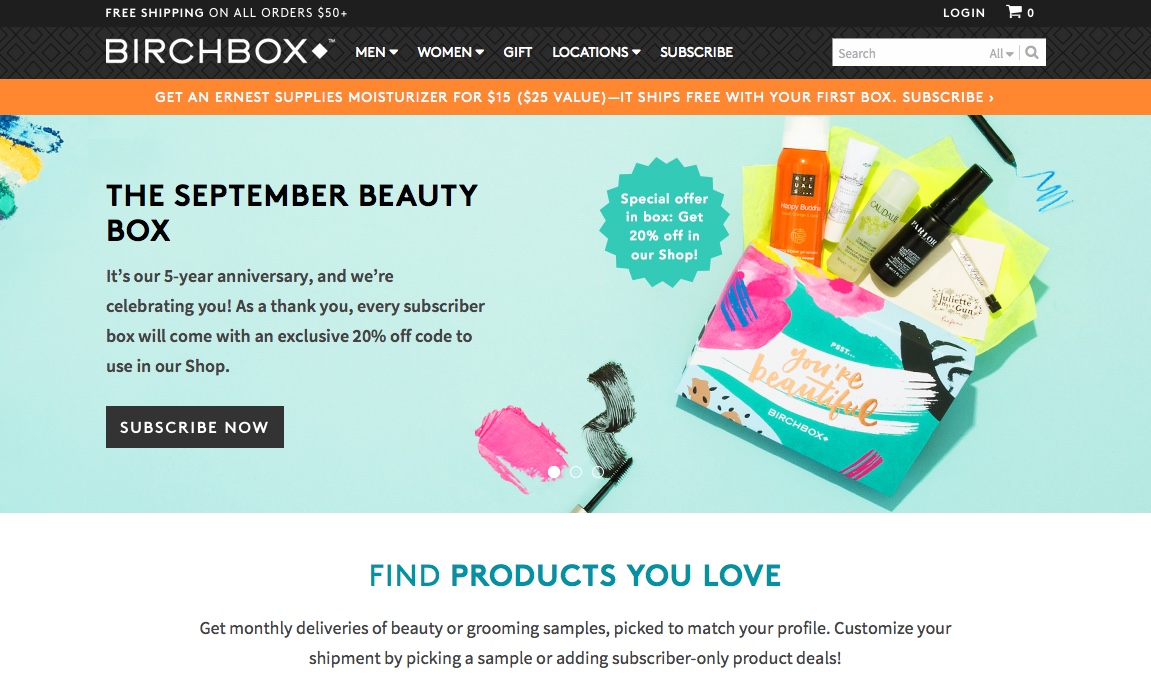
Birchbox is a subscription box for beauty supplies. Their homepage features a slider of highlighted products with pale blue and teal backgrounds. The slider, and the black menu bar above, greatly contrasts with an orange bar between the two that advertises a special from the latest box and urges the reader to subscribe.
Strategies to Decrease Cart Abandonment
Imagine that you walk into a department store, grab a shopping cart, and start wandering around. You pile items into your cart. Finally, with a cart loaded to the brim, you walk towards the checkout. But somewhere along the way, you don’t make it out the door with your purchases.
Maybe you were flabbergasted by the shipping cost. Maybe you didn’t want to create an account. Maybe you were frustrated because you saw a promo code box but couldn’t find a working promo code. Maybe you got distracted by a phone call.
Either way, you leave your cart behind, and wander out the front of the store without buying anything. This, maddenly, happens 68.53% of the time to online retailers.
There are some ways to majorly decrease shopping cart abandonment that have nothing to do with color. Some of them may seem a little obvious, but many online retailers persist in committing the same mistakes all the same. Here are some strategies to get you started:
- Make account creation an optional step at the end of the checkout process, not a mandatory step before it can begin.
- Be transparent about shipping costs through the entire process. Consider flat rate shipping to simplify things for the buyer, or offer a free shipping option above a certain price.
- Make the promo code box subtler. Many shoppers will leave your site to find a promo code if they see the option for it.
- Offer a variety of payment options. For some customers, paying with PayPal adds an extra layer of reassurance to shopping online.
Beyond those starter steps, there are several things you can do to decrease shopping cart abandonment using color psychology.
Draw Attention to Sales and Special Offers
By their very nature, sales and special offers are limited-time offers. They also cater to impulse buyers, who might not have otherwise added those items to their cart. In order to get the deal, customers need to act – and this will help decrease your cart abandonment rate.
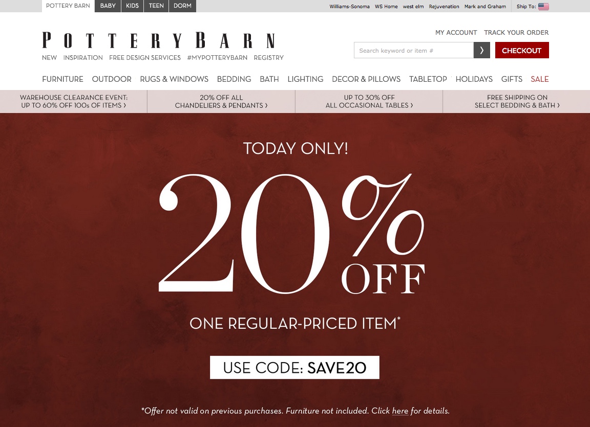
Pottery Barn sure caught my attention with this full-screen special offer announcement. It’s also red, giving it a sense of urgency.
Refine Your CTA Buttons
It’s time to take a look at the most important CTAs on your website, and not just the one on your homepage. Do your “Add to Cart” buttons stand out against the page or the products behind them? How about your checkout button?
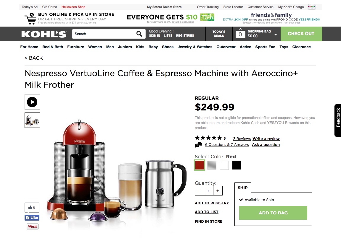
Kohl’s has no problem with this. On their eCommerce pages, two buttons stand out, bold and blazing green: “Add to Bag” and “Check Out.”
Create a Sense of Urgency
Use bright, impulse-buy colors like red and orange to create a sense of urgency. Paired with a good deal and a time limit, this can really make an impact in CTAs. Another place where this works well is on product pages when only a limited number of items are left in stock.
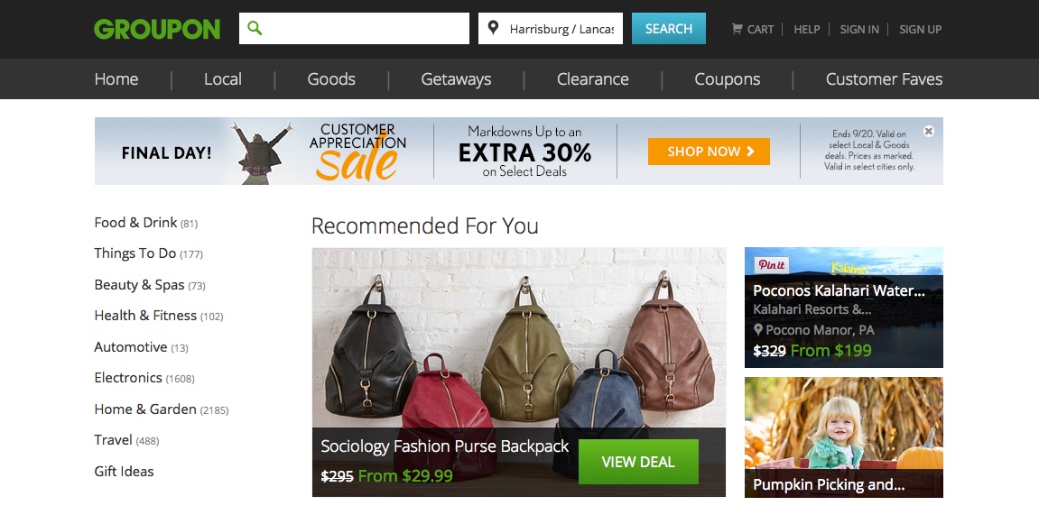
Groupon’s Customer Appreciation Sale banner is baiting me with a good deal, a time limit (the half hour between now and midnight), and the impulsive color orange.
Create a Sense of Trust
Using blue in sensitive places, like checkout pages, can help reassure potential customers about their purchases and the company they are working with.
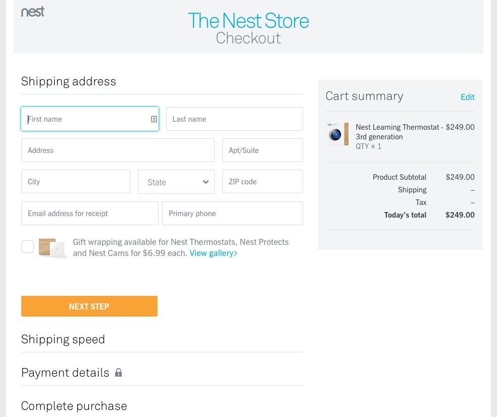
It’s subtle, but Nest uses blue accents throughout the checkout process. A big orange CTA button guides the viewer through the checkout, and the overall whiteness of the site makes the process feel simple and quick.
Always Be Testing
Color has a subtle but powerful influence on how a visitor interprets your products and company. In addition, the contrast those colors create can have a very noticeable impact on your bottom line.
However, as with any change you make to your eCommerce store, you should be wary of making assumptions about your audience. That’s where split testing comes in. It is very important to split test different variations of features on your website to see where your changes succeed and fail.
There are a number of free and low-cost split testing services you can use to test variations of your pages. Here are four to get you started:
So what are you waiting for? It’s time to start rethinking the colors on your website and how your visitors interact with them.