5 Effective Kinds of Visual Introductions
Yes, I know. You slaved over the introductory copy on your website, making sure it perfectly fit the audience to which you are selling your products or services.
Maybe you even forked over no small sum for an expert copywriter to craft it for you. Copy is incredibly important.
But you know what else is important? First impressions. People form a first impression in seven seconds or less – so they’re certainly not reading much before solidifying that initial opinion.
In those seven seconds, your visitor is building a scaffolding of assumptions about your products and services – how well they work, how trustworthy your business is, and other snap judgments that could make a world of difference in whether they do business with you or your competitor.
And much of this impression comes straight from your visuals.
There’s another good reason to get your visuals in tip-top shape. That’s because 65% of the population consists of visual learners.
Visual learners have an easier time getting the information they need from the visuals you provide than heavy blocks of text. To make the strongest impact with these people, you need a great visual introduction to your products or services.
The following examples showcase five different ways to introduce your products or services in a memorable and impactful way.
1. Introduce Your Product with Brilliant Photography
If you’ve got a product, and the product looks great, show it off with incredible product shots. After all, if they can’t hold your product in their hands, at least you can show them exactly what they’ll be getting.
This works best (and most obviously) with physical products, but it can work with technology products, like software.
Novation Launchpad Pro
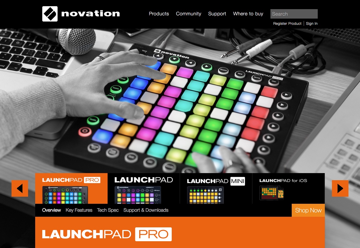
Novation’s Launchpad Pro is a grid instrument with pads that light up in hundreds of different colors. They showcase the product’s color range here by using a photo that is desaturated everywhere but on the instrument.
Adobe Photoshop
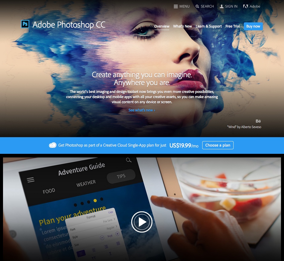
Photoshop’s product intro takes advantage of images created in the software, product shots, and screenshots to pull together an introductory experience that goes way beyond a list of screenshots.
Instead, users can see works in progress and at the end stage to see just how much the software is capable of.
Tip: Check out a detailed review of Adobe Photoshop.
2. Walk Them Through Your Service
Do you offer a service that is a little unusual or harder to understand? Walk your visitors through the process, explaining each step from the order to the end product.
This works best for quirky services where a few steps are involved. Or you can use it to show that, yes, your service really is that simple.
Handiemail
Update: Sadly, Handiemail is no more, but the visual introduction they used is still relevant to this day.
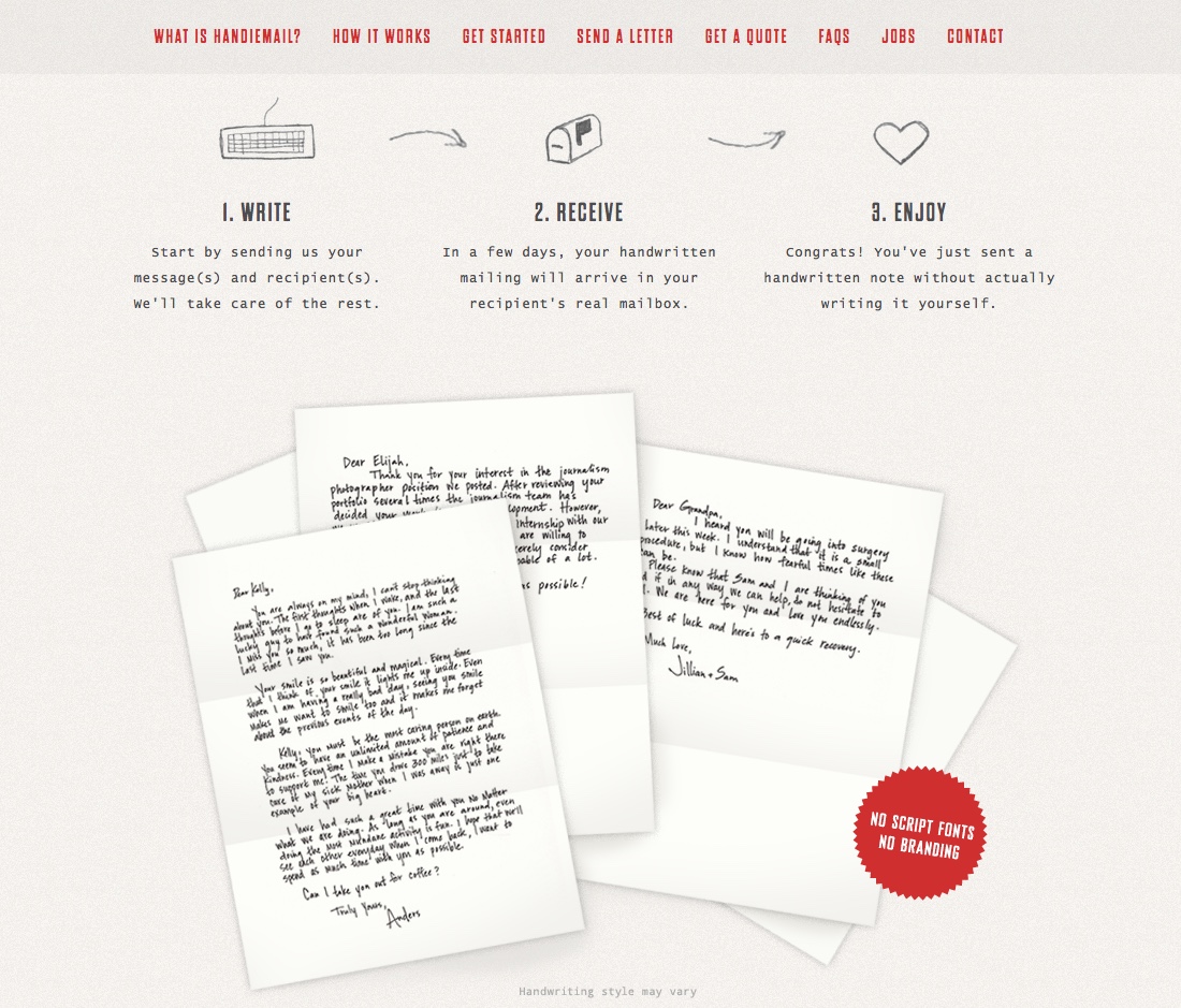
I was a little incredulous the first time I heard about Handiemail – a service that will actually handwrite and send messages on your behalf. But the service makes sense for busy professionals that are short on time and have a bit of a surplus of cash. Their “how it works” section guides visitors through just how simple it is, with cute hand-drawn icons for each part of the three-step process.
GiftRocket
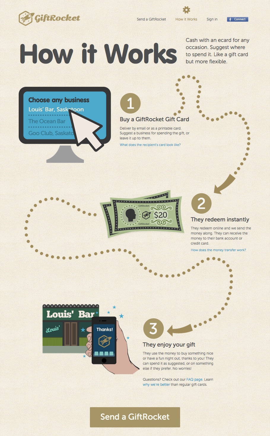
GiftRocket is a service that lets you give someone a gift card that they can use anywhere. It takes the sometimes impersonal interaction of transferring a friend money via PayPal and brings it to a new level with cute illustrations and a digital card. Their “How it Works” page walks visitors through the process, with a meandering dotted line and simple illustrations.
3. Use Subtle Animation to Make a Big Impact
Building a little bit of subtle motion or hover effects into your page can go a long way when you’re trying to introduce a product or service. Even a little bit of motion is enough to make a website feel more interactive and responsive than a purely static website.
This works best for livening up technology products and services, where the product is usually something intangible.
Bucketlistly
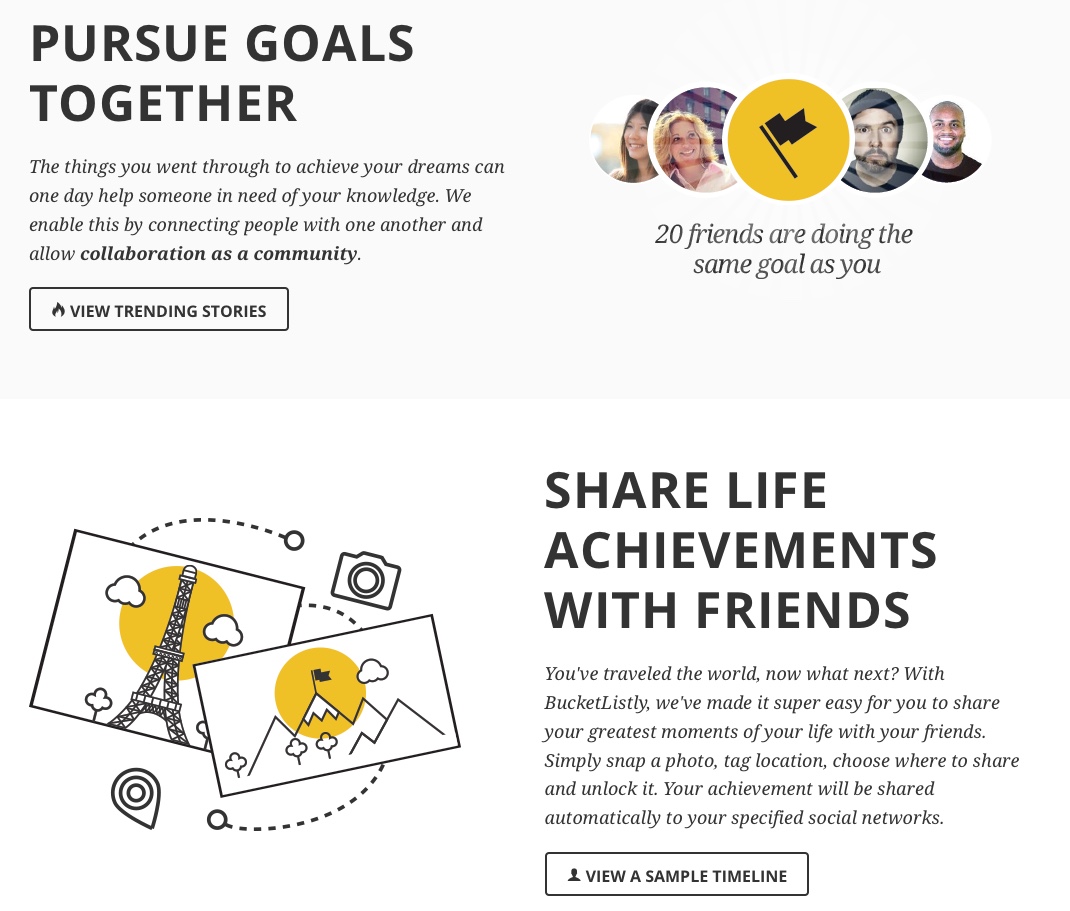
Bucketlistly is an app and social community for people who want to check life experiences off their bucketlist. The main page is a brief introduction to the features of the service, with simple hover dialogues over interactive parts of an example achievement, and rotating rays of light around an unlocked badge. Beyond the animation, the same mustard yellow highlight color is used to good effect throughout the site.
Forward
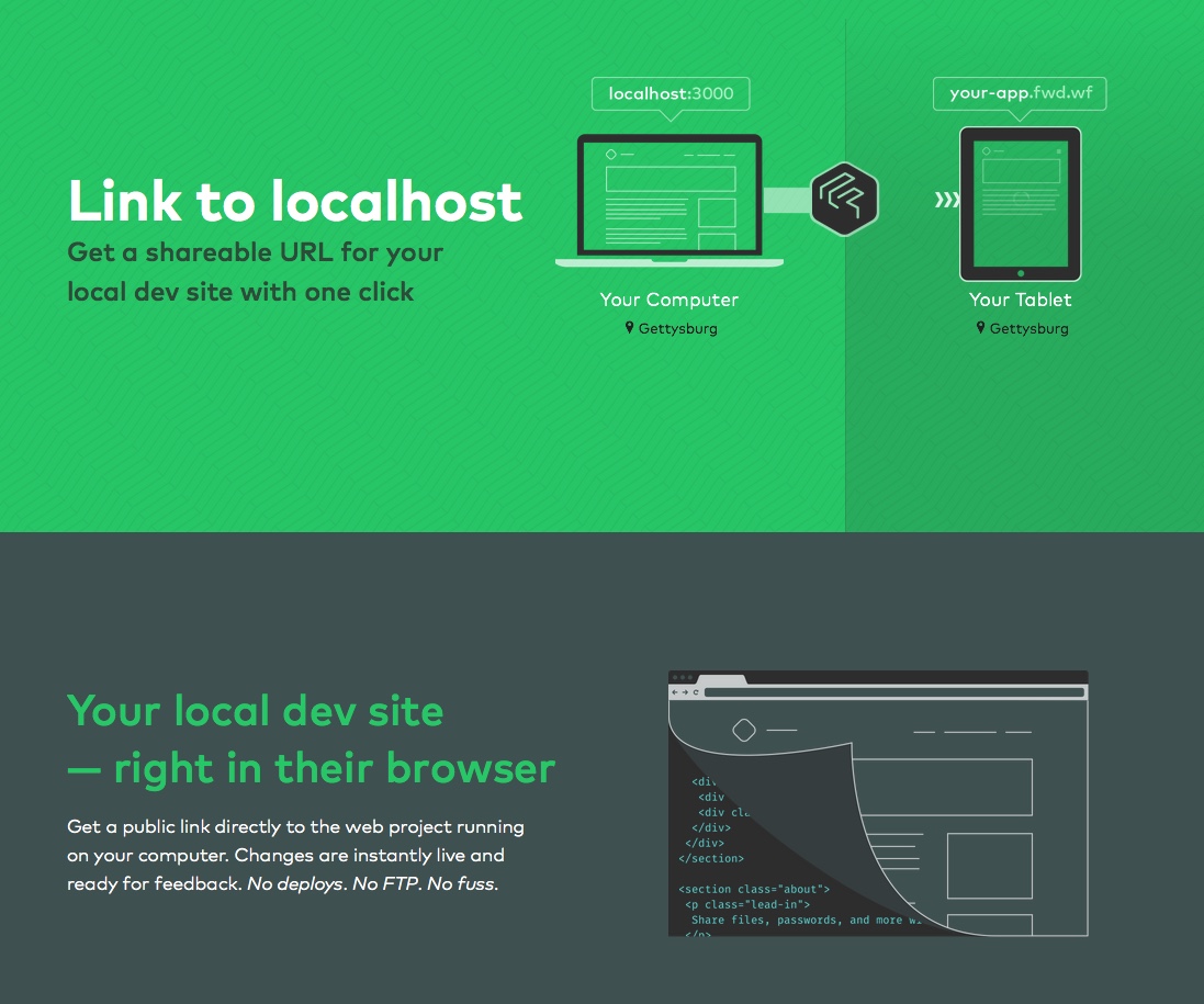
Forward is a service that creates a public link for a locally-hosted project. Their website uses a striking green and grey color combination reminiscent of a computer motherboard, with simple animated illustrations that show how the service works. The animations make it really easy to understand the utility of such a service, and as a bonus they are fun to watch!
4. Send Them on a Guided Tour
Want to really immerse potential customers in what you can do for them? Have some really unique features you want to highlight? Put them front and center in a guided tour!
This works best for products and services that require some explanation or that have really stand-out features.
Tumblr
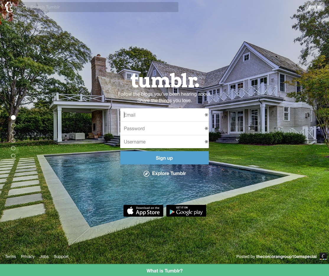
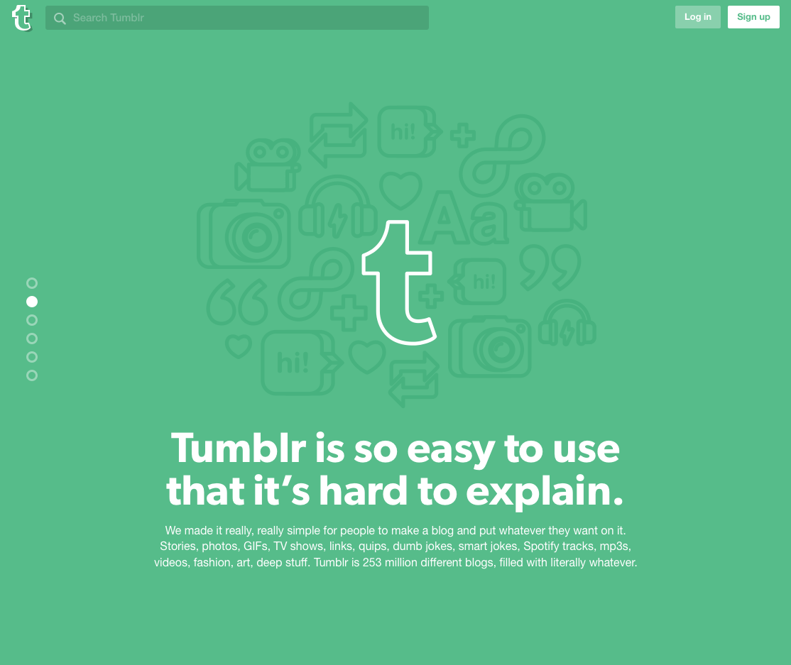
Some people just don’t “get” Tumblr yet. That’s why they’ve turned their main page into a brief but beautiful full-screen introduction. Scrolling will pop you down the page one slide at a time, so you can read about all the different types of media you can post on Tumblr.
Hell’o Baby
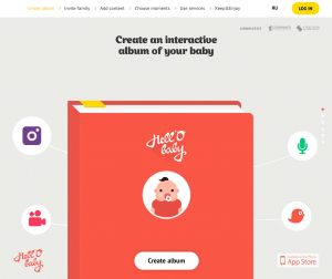
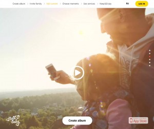
The folks at Hell’o Baby have taken the plain old baby album and put it on steroids. This isn’t just your average book of photographs; it’s a multimedia smorgasbord with photos, videos, soundbytes, and more, and they have the interactive introduction to match it.
5. Create a World to Explore
If you have a really unique product or service, maybe it makes the most sense to break the mold and go beyond what people typically think of as web content. Instead of presenting your product in a typical grid format, an immersive experience can really make people sit up and take notice.
This works best for products or services that are selling something greater than the sum of their parts; this way you can show the potential. This is what your product can do for people.
Future Water City
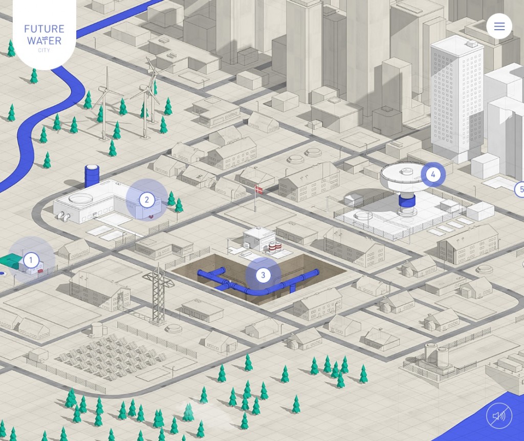
VCS Denmark created Future Water City to show the potential of state-of-the-art technologies to reinvent water infrastructure. The interactive map presents an isometric, blueprint-style city that showcases a variety of innovations. Visitors can move around the map, reading and watching videos about each of the technologies highlighted with a blip.
Urban Walks
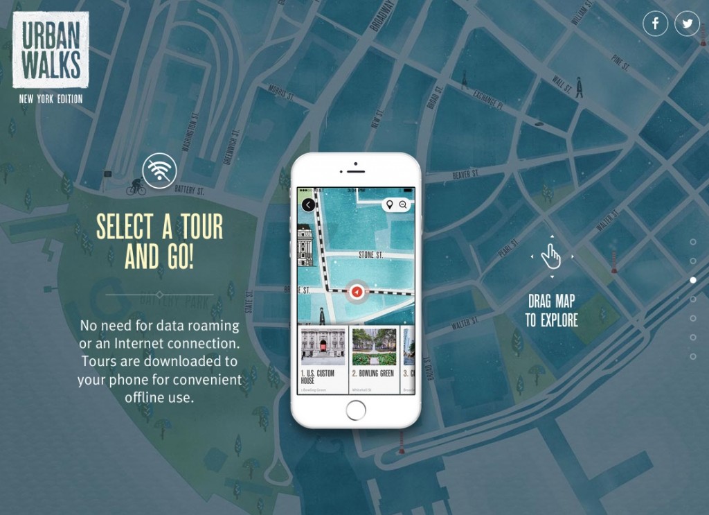
Urban Walks is a carefully-constructed walking tour app. On the third screen of their intro slides is a blown-up watercolor map of New York City just begging to be explored. Landmarks that are invisible in the background appear as you roll the phone over them. The message is clear: this app will help you discover incredible things you would never have otherwise seen. (If you’re interested, the team behind the app created an equally immersive walkthrough of the design process.)
Matching Your Visuals to Your Service
As you decide how to best introduce your product or service to the world, it is important to remember one thing: one size does not fit all.
As explained above, certain kinds of visual introductions out-perform others for certain kinds of services. Some of it has to do with what you’re selling; the visuals to introduce a beautiful product are going to be very different from those used to introduce an intangible technology product. If you have to explain a service, your introduction will likely be more process-oriented. If you are selling an experience or an idea more than an actual product or service, your website needs to reflect that.
In addition to this, you need to consider tone. Is your product serious, geared at solving a real problem like Forward or Future Water City? Or are you going for something more light-hearted, like Dollar Shave Club or Handiemail? The colors, the quality of your illustrations or photography, and your choice of typography have just as much to do with imparting a particular tone as your copy does.
As you create visuals to introduce your product or service to the world, the #1 thing on your mind should be crafting a strong first impression. To do that, focus on how you can show, instead of tell, the world about your products.