How to Reduce Bounce Rate Through Good Design
You’ve done all the hard work in attracting a visitor to your site, the last thing you need is for them to take one look and leave straight away. In this week’s post we share some ways to reduce your website’s bounce rate through good design.
Often known as the kiss of death, a high bounce rate not only hurts your search engine ranking, but it also affects your sales and reputation.
If you can’t lead visitors to other pages from your website, it’s very likely that they will never come back and buy from you.
Of course, there are ways to fix this and reduce your bounce rate, mainly by improving your design.
Here’s what you need to do:
Use intuitive and clear navigation
Bad navigation is one of the top reasons why people leave websites within the first few seconds of visiting them.
Complex and inconsistent navigation causes the user to feel frustrated, confused and angry.

What would you do if you visited a website and couldn’t find what you were looking for? You’d probably give up and leave, right?
Follow these 3 steps to ensure flawless navigation:
1. Understand how users are used to browsing sites
Web users have acquired certain habits when it comes to browsing. They expect websites to have a similar structure so that they can navigate smoothly through all pages.
To deliver smooth navigation for your users:
- Design a quick and easy-to-use navigation menu on top
- Include a search bar on top
- Put important information above the fold and all the details below the fold
- Put content in sections
2. Understand how your audience wants to browse your site
Understanding what your users want to find and helping them reach it is one of the best ways to reduce your bounce rate.
The most efficient ways to better understand your visitors are:
- Use analytics tools – Google Analytics, CrazyEgg and KISSmetrics will help you better understand how people use your site. The data that you collect will show you how to improve your site and reduce your bounce rate.
- Interview and survey your audience – one of the best ways to understand what your customers want is to ask them. Feel free to use tools like Google Forms or SurveyMonkey for surveys, or schedule interviews to ask people over the phone.
- Run usability tests – use UserTesting to test different versions of your page and get real-time feedback on your design and user flow from visitors. They’ll tell you exactly what frustrates them and you’ll see when they have troubles finding what they need.
3. Design information around priorities
Put the most important information first and leave all details for last.
In your top menu, it makes sense to first list “Features” or “Services”, followed by “Pricing” and then “Blog” and “Contacts”.
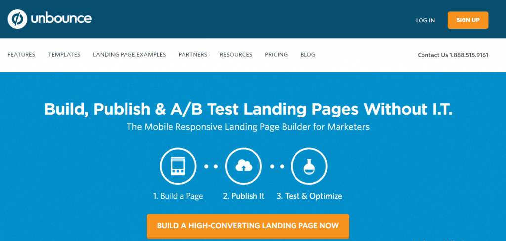
Unbounce has top menu is clear and includes the choices that visitors have come to expect.
This is the natural flow of navigation that people expect from a website. The same is true for the content on your pages.
In the section that falls above the fold on your homepage, people expect to understand who you are and what you can offer them. They then expect to find details as they read down the page.
If you want to reduce your bounce rate, it’s important to list features and pricing on separate pages.
Cut out distractions
Websites with too much noise and lots of distractions irritate visitors. They prefer clarity and messages that get right to the point.
Otherwise, they bounce.
Here are some way to minimize distractions:
1. Remove auto-play video and audio
Let the user decide when to play a video.
There’s nothing is worse than being blasted with background music or a voice when you’re not expecting it.
Confused visitors are more likely to close the tab than to pay attention to your interruptive message.
2. Avoid too many ads
Always remember that you won’t make any money without visitors.
Too many ads not only detracts from the overall look and feel of a site, but also sends out the wrong message that you’re more interested in serving up ads than great content or service.
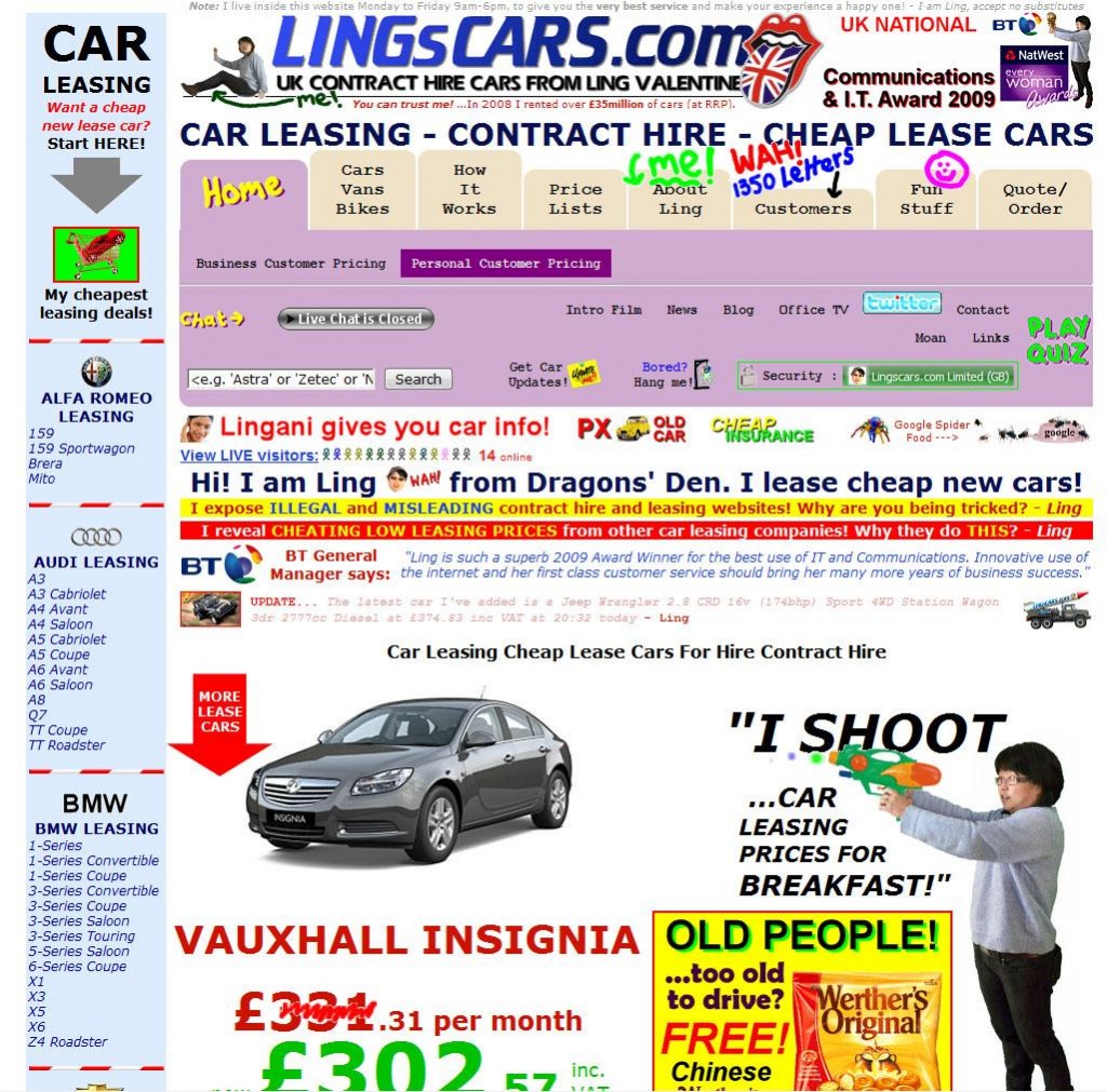
Lingscars.com
So, limit the space dedicated to ads and focus on providing your visitors with a great user experience instead.
3. Use white space
You don’t need to fill every square inch of your website.
Use empty ‘white’ space to allow your site room to breath, and helps visually direct your visitors to the important parts of your site.
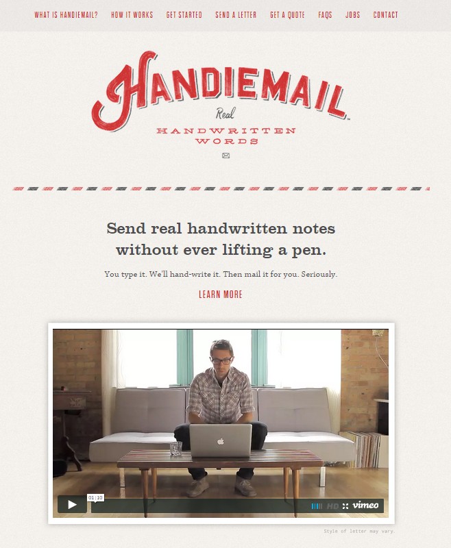
Handiemail features a simple, clean, easy to read layout that uses plenty of white space.
4. Use pop-ups strategically
Most pop-ups provide an awful user experience, mainly because they are irrelevant to the content the user is currently viewing.
But this doesn’t mean that you should avoid pop-ups at all costs. In fact, there are ways to use them to decrease your bounce rate and increase your conversion rate.
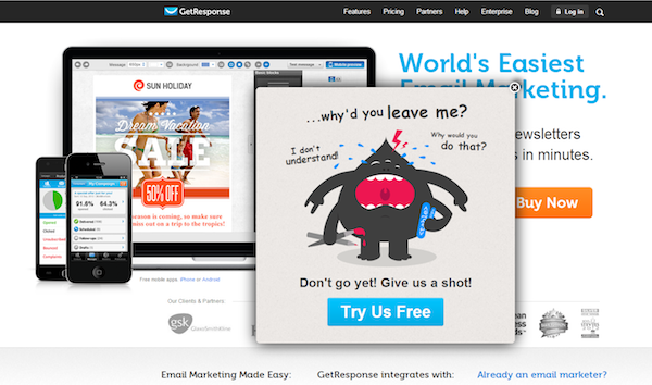
One of the smartest strategies is to use exit intent pop-ups, like this one:

When visitors try to navigate away from Quicksprout, this popup displayed.
How are exit intent pop-ups different?
Normal pop-ups interrupt the user when they’re reading your blog post. Exit intent overlays are shown only when someone is about to leave your site.
Exit intent popups allow you to get the visitor’s attention with an attractive offer and lead them to another page for increased conversion.
Use a color contrast
What is a color contrast?
Contrasting colors simply look different. If you put them next to each other, you’d be able to easily distinguish them.
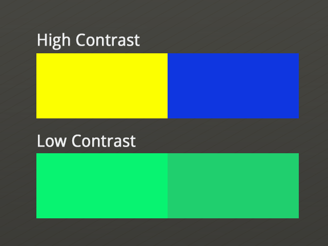
In other words, highly contrasting colors helps people perceive each element as separate.
How many colors to use?
Use as many as you’d like (without going overboard), of course! However, keep in mind that a smaller number of colors are easier to manage and are easier for your audience to remember you as a brand as well.
3 colors is a great place to start — enough to add variation to your design, but not so many that they end up frustrating the user.
Remember, you don’t have to use all colors equally on your page. Balance is the key. Try balancing an abundant use of one strong color with smaller amounts of several lighter or more subtle colors.
Apply the 60 – 30 – 10 rule:
- 60% – primary color
- 30% – secondary color
- 10% – accent color
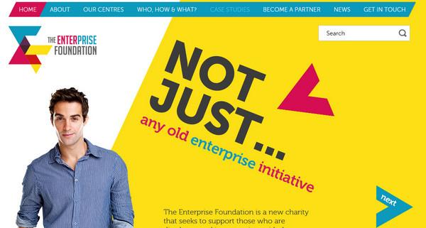
The Enterprise Foundation makes good use of the 60-30-10 rule.
Which colors make a good combination?
There are no ‘wrong’ color combinations to use for website design, and if you stick to the 60-30-10 rule you won’t go wrong.
To help you select great color combinations, try using the free Adobe Color CC tool.
Focus on readability and proper formatting
Did you know that most people that come to your website won’t read every single word? Instead, they’ll probably scan the content until they find what they’re looking for.
To help users do that, focus on the following:
1. Larger fonts and headlines
They are easier to read and understand. For headlines, we recommend using a font size of at least 18 in Helvetica.
Remember, you should also use subheadings with H2 heading tags to break down the information, thus making it easier to read.
This will allow visitors to easily spot the main points of your content and stop to read the part that most interests them.
2. Use small paragraphs
Big paragraphs are harder for most people to read.
Ideally, you should have 2-3 sentences per paragraph.
3. Use bullet points
Use these organizers to break down your content and show off your most important points.
Bullets get readers’ attention and are very effective for listing benefits, features, etc.
4. Make the text readable
If your text is readable, it will be easier for your readers to understand. The easier it is for someone to understand your writing, the better.
To achieve this, avoid using jargon, scientific vocabulary, and industry-specific terms.
To define how readable your text is, you can use the Flesch Reading Ease Formula.
Leverage internal search
When to use a search engine
If you have an eCommerce site or a blog, you should definitely have an internal search function. This will allow people to easily find the products they want to buy or the blog posts they want to read.
For anything other than blogs and eCommerce sites, an internal search engine won’t be of much use. You probably won’t need it if you have a service-based business. The only exception is for the blog section of a service-based business, and only if the blog is large and full of great content.
Where to place your search bar
This will differ depending on what type of the site that you have.
For eCommerce sites, it is best to place the search bar in the top middle section of your page. This is the primary way people search for products, so it makes sense to place it there.
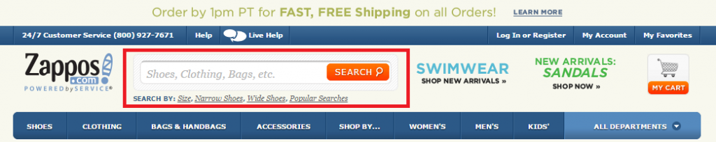
Zappos places its search bar prominently at the top header
For busy blogs, placing your search bar at the top right will give your visitor the choice of searching for specific pieces of content.
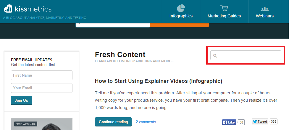
Kissmetrics’s blog contains bucket-loads of great content, and the use of the search bar helps visitors find what they want.
Use suggestions
When people are typing a product into the search bar, show them various suggestions that they can choose from. This will improve click-through rates and, of course, reduce your bounce rate.
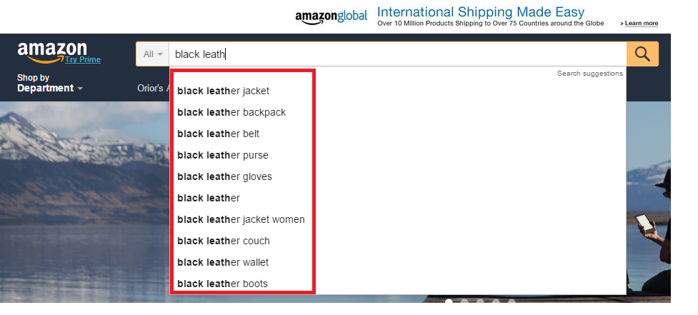
Suggestions are especially helpful for large e-commerce sites like Amazon.
Invest in responsive and mobile-friendly design:
Your website might look great on a PC, but how does it look on mobile devices? Or a tablet?
Back in 2013, worldwide mobile phone internet user penetration was 73.4%. This figure is projected to jump to 90% by 2017.
With such a large number of people browsing websites from all mobile devices, Google has even started to penalize non-mobile friendly sites. So it’s more important now than ever to make sure you provide a flawless user experience regardless of the screen size.
To do that, you need to make your website as responsive and mobile-friendly as possible.
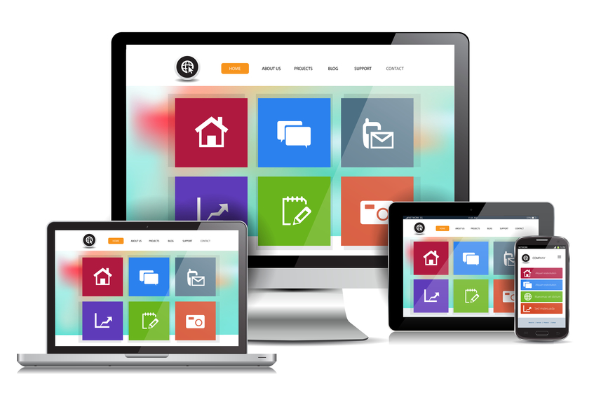
Whether it’s on a desktop, a tablet, a laptop or a mobile phone, your website should be easy to use and navigate
In Conclusion
Reducing your bounce rate comes down to one thing – understanding what your visitors are searching for and making it easier for them to find it.
If you are naturally leading people to the pages they want to visit, you won’t have any problems reducing your bounce rate.
Do you struggle with a high bounce rate? How do you plan on reducing it? Let me know in the comments below.